library(readxl) #...........read in data file
library(tidyverse) #.........data wrangling
library(janitor)  #..........data wrangling
library(ggforce)  #..........viz faceting
library(patchwork)  #.......combine plots
library(ggthemes)  #.........text csztomizations
library(ggtext)  #.........text csztomizations
library(sysfonts)  #.........generate viz fonts
library(showtext)  #.........generate viz fonts
library(monochromeR)  #.........viz colour selection
library(fontawesome)Comparative Analysis of Healthcare Funding Modes in West Africa
lubridate
Tidyverse
Understanding the trend of healthcare cost burden in West Africa
Now that you are here:
If you are here, that means only one thing: you are interested in understanding the R workflow for my ‘Healthcare Funding Modes in Africa’ project. So, let’s dive right into it.
Project Focus:
Conduct a comparative analysis of how healthcare is funded in Sub-Saharan West Africa.
A quick back story: I work in healthcare; and my interest revolves around understanding how finance, tech adoption and stakeholder behavior impact business operations.
To deliver a project I recently worked on, it was important that I understand how the financial burden of medical care is shared among three key stakeholders: patients, governments and care providers. This is what birth this project.
Project:
Why don’t you just find out for yourself; follow the workflow.
Dataset:
Global Health Expenditure Database, WHO
A. Load R Packages
B. Data Preparation
i. Data import
# Data Importfrom Excel sheet

datatable <- readxl::read_xlsx("NHA indicators.xlsx")

initial_table <- datatable %>%
  slice(-1) %>%
  pivot_longer(
    cols = starts_with("20"),
    names_to = "year",
    values_to = "value",
    values_transform = as.numeric,
    names_transform = as.factor
  ) %>%
  select(-...3)

head(initial_table)
# A tibble: 6 × 4
Countries Indicators year value
<chr> <chr> <fct> <dbl>
1 Benin Current health expenditure by financing schemes 2011 320.
2 Benin Current health expenditure by financing schemes 2012 343.
3 Benin Current health expenditure by financing schemes 2013 359.
4 Benin Current health expenditure by financing schemes 2014 358.
5 Benin Current health expenditure by financing schemes 2015 311.
6 Benin Current health expenditure by financing schemes 2016 330.ii. Data Wrangling
wrangled_table <- initial_table %>%
  # filter out current health expenditure by financing schemes
  filter(!str_detect(Indicators, "Current")) %>%
  group_by(Countries, Indicators) %>%
  summarise(total = sum(value)) %>%
  mutate(
    percent = total / sum(total) * 100,
    across(
      where(is.numeric),
      ~ round(., 2)
  # create 'spending class' variable using sum spending ranking
    ),
    spend_class = case_when(
      percent > 70 & Indicators == "Household out-of-pocket payments (OOPS)" ~ "Above 70",
      percent < 30 & Indicators == "Household out-of-pocket payments (OOPS)" ~ "Below 30",
      percent > 50 & Indicators == "Household out-of-pocket payments (OOPS)" ~ "50 - 70",
      percent > 30 & Indicators == "Household out-of-pocket payments (OOPS)" ~ "30 - 50",
      TRUE ~ " "
    )
  ) %>%
  # this part was a bit tricky.There should be a better way to do this
  mutate(
    oops_class = case_when(
      spend_class != " " ~ spend_class,
      spend_class == " " & lag(spend_class) != " " ~ lag(spend_class),
      spend_class == " " & lead(spend_class) != " " ~ lead(spend_class),
      TRUE ~ ""
    )
  ) %>%
  # group countries into 'spending class' using sum spending ranking
  mutate(
    oops_class = factor(oops_class,
      levels = c(
        "Below 30", "30 - 50",
        "50 - 70", "Above 70"
      ), ordered = TRUE
    )
  ) %>%
  # drop spending class variable
  select(-spend_class)

head(wrangled_table)
# A tibble: 6 × 5
# Groups: Countries [2]
Countries Indicators total percent oops_class
<chr> <chr> <dbl> <dbl> <ord>
1 Benin Government schemes and compulsory contr… 1228. 30.9 30 - 50
2 Benin Household out-of-pocket payments (OOPS) 1890. 47.5 30 - 50
3 Benin Voluntary health care payment schemes 859. 21.6 30 - 50
4 Burkina Faso Government schemes and compulsory contr… 5108. 57.5 30 - 50
5 Burkina Faso Household out-of-pocket payments (OOPS) 3013. 33.9 30 - 50
6 Burkina Faso Voluntary health care payment schemes 769. 8.65 30 - 50 C. Prepare for Data Vizualization
i. Compute Midpoints
This workflow is important for the selected viz option: a divergent bar chart.
# Prepare Table For Vizualization

viz_table <- wrangled_table %>%
  # filter out the voluntary contribution rows
  filter(!str_detect(Indicators, "Voluntary"))
# Compute Midpoints for Data viz - a perequisite for creating divergent bar chart
midpoint_data <- viz_table %>%
mutate(
middle_shift = percent[1],
lagged_percentage = lag(percent, default = 0),
left = cumsum(lagged_percentage) - middle_shift,
right = cumsum(percent) - middle_shift,
middle_point = (left + right) / 2,
width = right - left
)
head(midpoint_data)# A tibble: 6 × 11
# Groups: Countries [3]
Countries Indicators total percent oops_class middle_shift lagged_percentage
<chr> <chr> <dbl> <dbl> <ord> <dbl> <dbl>
1 Benin Governmen… 1228. 30.9 30 - 50 30.9 0
2 Benin Household… 1890. 47.5 30 - 50 30.9 30.9
3 Burkina Fa… Governmen… 5108. 57.5 30 - 50 57.5 0
4 Burkina Fa… Household… 3013. 33.9 30 - 50 57.5 57.5
5 Cabo Verde Governmen… 772. 71.6 Below 30 71.6 0
6 Cabo Verde Household… 266. 24.7 Below 30 71.6 71.6
# ℹ 4 more variables: left <dbl>, right <dbl>, middle_point <dbl>, width <dbl>ii. Declare dependencies and load fonts
font_add_google("Roboto", "roboto")
font_add_google("Fira Sans Condensed", "fira")
font_add('fa-brands', 'fonts/font_inner/otfs/Font Awesome 6 Brands-Regular-400.otf')
showtext_auto()
github_icon <- ""
github_username <- "Gracious 'Kolade"
# Set Viz Colours
component_colours1 <- c(
"Government schemes and compulsory contributory health care financing schemes"= "#244855",
"Household out-of-pocket payments (OOPS)"= "#874f41" )
viz_colours <- tibble(txt_col = "#141414",
numcol = "#141414",
bar_col = "#454545",
bar_col1 = "#282C35",
title_col= "#141414",
subtitle_col ="#2C2E3A"
)
#Declare plot titles
plot_titles <- tibble(
maintitle = "Comparative Analysis of Healthcare Spending Modes in West Africa [2011 - 2021]",
subtitle = "Despite billions of dollars in healthcare expenditure, the personal financial burden of medical care (out-of-pocket spending) is highest in Nigeria at over 73% of total cost;\nCape Verdeans only shoulder about 25% of total care cost.",
caption = "Data Source: Global Health Expenditure Database, WHO <br><span style='font-family:fa-brands'></span> Gracious 'Kolade"
)
# Set other dependencies
barwidth <- 0.75D. Data Viz.
i. Create baseplot
# Baseplot

baseplot <- midpoint_data %>%
  ggplot() +

  geom_tile(
    aes(
      x = middle_point,
      y = fct_rev(as_factor(Countries)),
      width = width,
      fill = Indicators),
    height = barwidth) +

# facet data categories
  ggforce::facet_col(
    facets = vars(oops_class),
    scales = "free_y",
    space = "free") +

  scale_fill_manual(
    values = component_colours1) +

# Set scale limits on x-axis
  scale_x_continuous(
    breaks = seq(-100, 100, by = 20), limits = c(-100, 100)) +

   theme_minimal(base_family = "fira", base_size = 15) +

# set theme
  theme(
    text = element_text(colour = viz_colours$numcol),
    legend.position = "none",
    axis.title = element_blank(),
    axis.text.x = element_blank(),
    panel.grid = element_blank(),
    strip.text = element_blank(),
    panel.spacing = unit(0, "pt"), # reduce facet panel spacing
    axis.text.y = element_text(colour = viz_colours$numcol)
  )

baseplot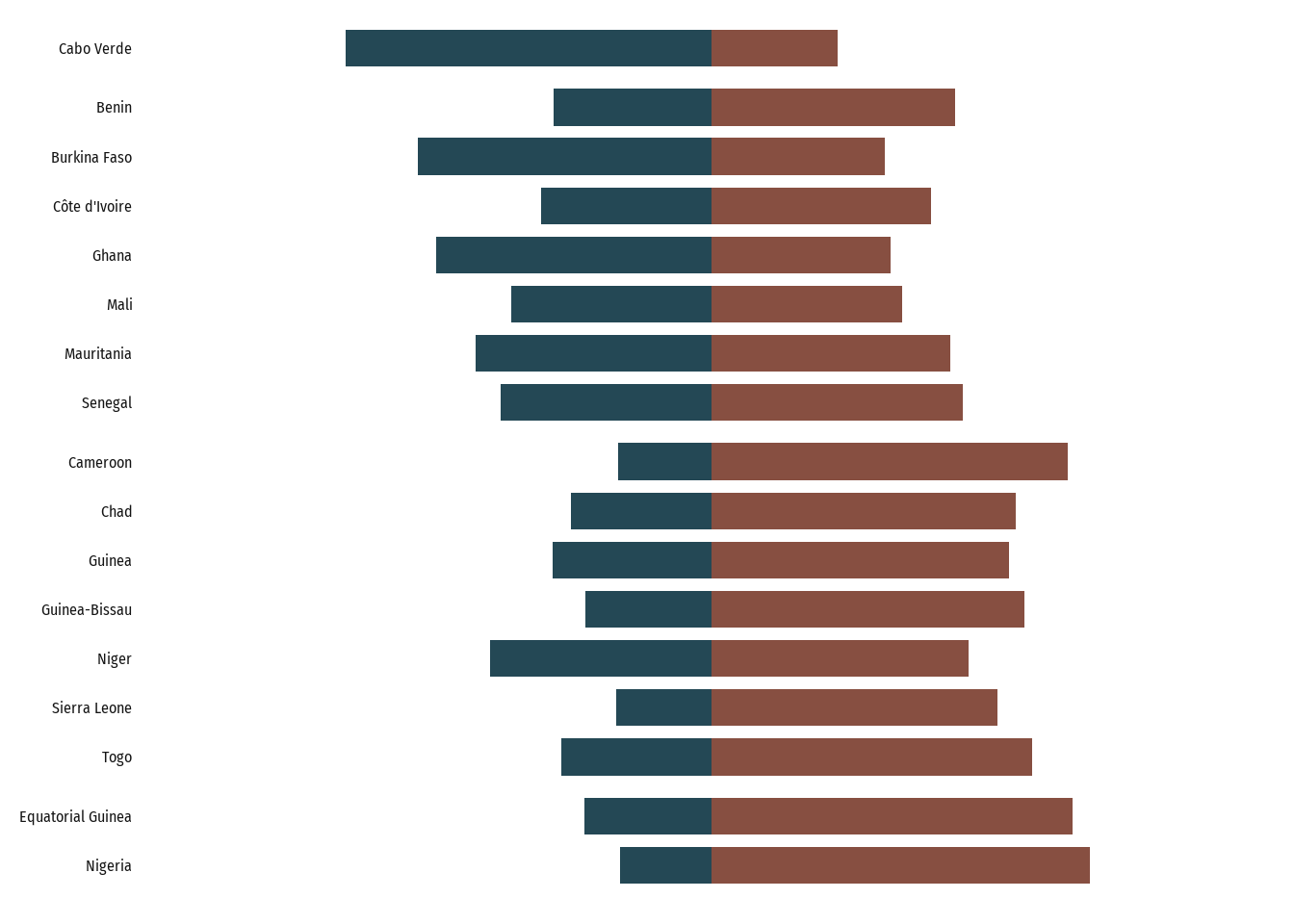
ii. Add percentage labels to baseplot
# Add labels to plot segments

baseplot_with_labels <- baseplot +

  #Add percentage labels on right bars
  geom_text(
    data = midpoint_data %>%
      filter(str_detect(Indicators, "out-of-pocket")),
    aes(
      x = right,
      y = Countries,
      label = round(percent, 1)
    ),
    size = 3.5,
    color = viz_colours$numcol,
    family = "fira",
    fontface = "bold",
    hjust = -0.5
  ) +

  #Add percentage labels on left bars
  geom_text(
    data = midpoint_data %>%
      filter(str_detect(Indicators, "Government schemes")),
    aes(
      x = left,
      y = Countries,
      label = round(percent, 1),
    ),
    size = 3.5,
    color = viz_colours$numcol,
    family = "fira",
    fontface = "bold",
    hjust = 1.5
  ) +
 scale_y_discrete(
    expand = expansion(
      add = .8
    )
  )


baseplot_with_labels
iii. Add category label to divergent bars
# clean labels
label_guide <- c(
  "Government schemes and compulsory contributory health care financing schemes" = "a. Government & Compulsory\nContribution Schemes (%)",
  "Household out-of-pocket payments (OOPS)" = "b. Out-of-Pocket\nExpenses (%)"
)

firstbaseplot_category_labels <- baseplot_with_labels +
 #Notice how labels are forced on the first bar.
  geom_text(
    data = midpoint_data %>%
      filter(Countries == "Cabo Verde"),
    aes(
      x = middle_point + c(-15, 25),
      y = Countries,
      label = label_guide
    ),
 # Adjust label appearance
    nudge_y = 3,
    colour = component_colours1,
    size = 3.5,
    family = "fira",
    fontface = "plain",
    vjust = 1.5,
    lineheight = .9,
  )


firstbaseplot_category_labels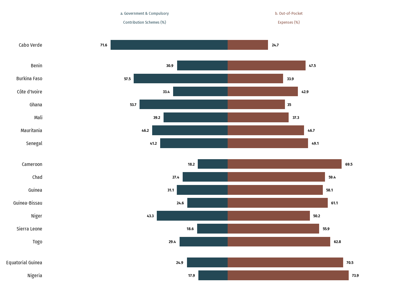
E. Create a Second Plot
i. Prepare data
# Data Preparation for a 'Total Spend' Plot

total_spending <- midpoint_data %>%
  ungroup() %>%
  group_by(Countries) %>%
  summarise(total_healthcare_spending = sum(total))

total_spend_table <- total_spending %>%

# Not the best of method
  mutate(
    oops_class = c(
      "30 - 50",
      "30 - 50",
      "Below 30",
      "50 - 70",
      "50 - 70",
      "30 - 50",
      "Above 70",
      "30 - 50",
      "50 - 70",
      "50 - 70",
      "30 - 50",
      "30 - 50",
      "50 - 70",
      "Above 70",
      "30 - 50",
      "50 - 70",
      "50 - 70"
    ),
    oops_class = factor(oops_class,
      levels = c(
        "Below 30", "30 - 50",
        "50 - 70", "Above 70"
      ), ordered = TRUE
    )
  )

head(total_spend_table)
# A tibble: 6 × 3
Countries total_healthcare_spending oops_class
<chr> <dbl> <ord>
1 Benin 3117. 30 - 50
2 Burkina Faso 8121. 30 - 50
3 Cabo Verde 1038. Below 30
4 Cameroon 12936. 50 - 70
5 Chad 4986 50 - 70
6 Côte d'Ivoire 15021. 30 - 50 ii. Plot second baseplot
# Second Baseplot (Sum Plot)

second_baseplot <- total_spend_table %>%
  ggplot() +
  geom_col(
    aes(
      y = fct_rev(as_factor(Countries)),
      x = total_healthcare_spending,
    ),
    fill = viz_colours$bar_col
  ) +
  ggforce::facet_col(
    facets = vars(oops_class),
    scales = "free_y",
    space = "free",
  ) +

  theme_minimal(base_size = 15) +

 geom_text(
    aes(
      y = fct_rev(as_factor(Countries)),
      x = total_healthcare_spending,
      label = paste0("$", (round(total_healthcare_spending / 1000, 2)), "B")
    ),
    size = 3.5,
    hjust = -0.1,
    color = viz_colours$numcol,
    fontface = "bold",
    family = "fira"
  ) +

  theme(
    axis.title = element_blank(),
    axis.text.x = element_blank(),
    panel.grid = element_blank(),
    strip.text = element_blank(),
    panel.spacing = unit(0, "pt"),
    axis.text.y = element_blank(),
  ) +

  #Adjust plot scale for easy readability
  scale_x_continuous(
    breaks = seq(0, 180000, by = 20000),
    limits = c(-0, 180000)
  ) +
 # Add a separating space for each spend class facet along the y-axis
scale_y_discrete(
    expand = expansion(
      add = 0.8
    )
  )

second_baseplot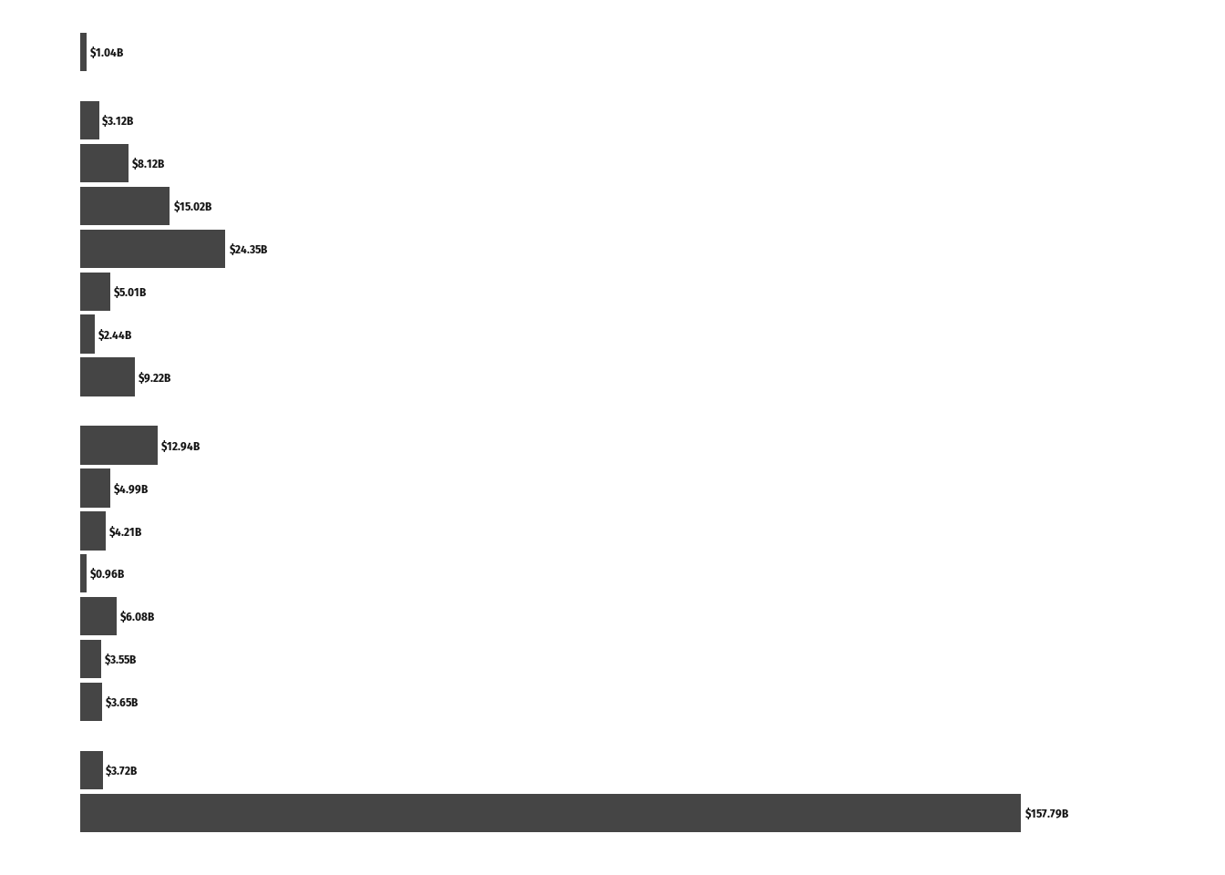
iii. Add category label
 secondbaseplot_category_labels <- second_baseplot +
  geom_text(
    data = total_spend_table %>%
      filter(Countries == "Cabo Verde"),
    aes(
      x = 0,
      y = Countries,
      label = "c. Total Cost\n[a + b + Voluntary Contributions]"
    ),
    nudge_y = 3,
    size = 3.5,
    family = "fira",
    fontface = "plain",
    vjust = 1.5,
    hjust = .05,
    lineheight = .9,
    color = viz_colours$txt_col
  )

secondbaseplot_category_labels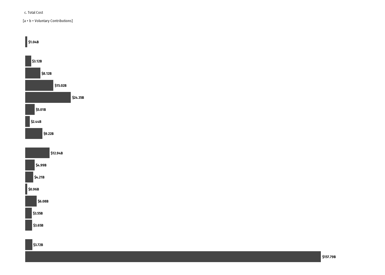
F. Combine Both Plots
finalplot <- firstbaseplot_category_labels +  secondbaseplot_category_labels +

  plot_layout(
    ncol = 2,
    width = c(2, 1.5)
  ) +

  plot_annotation(
    title = plot_titles$maintitle,
    subtitle = plot_titles$subtitle,
    caption = plot_titles$caption,
    theme =
      theme(
        text = element_text(colour = viz_colours$txt_col,
                        family = "fira"),

    plot.title = element_text(colour = viz_colours$title_col,
                              size = 17,
                              hjust = 0.5,
                              margin = margin(10,0,6,0),
                              #TRouBLe (Top, Right, Bottom, Left)
                              face = "bold"),
    plot.caption = element_markdown(),
    plot.subtitle = element_text(size = 12,
                                           vjust = 3,
                                           hjust = 0.5,
                                           lineheight = 1,
                                           margin = margin(5,0,10,0),
                                           colour = viz_colours$subtitle_col
                                           ),
    plot.margin = margin(rep(18,4)),
    plot.background = element_rect(fill= "white")
      )
  )


finalplot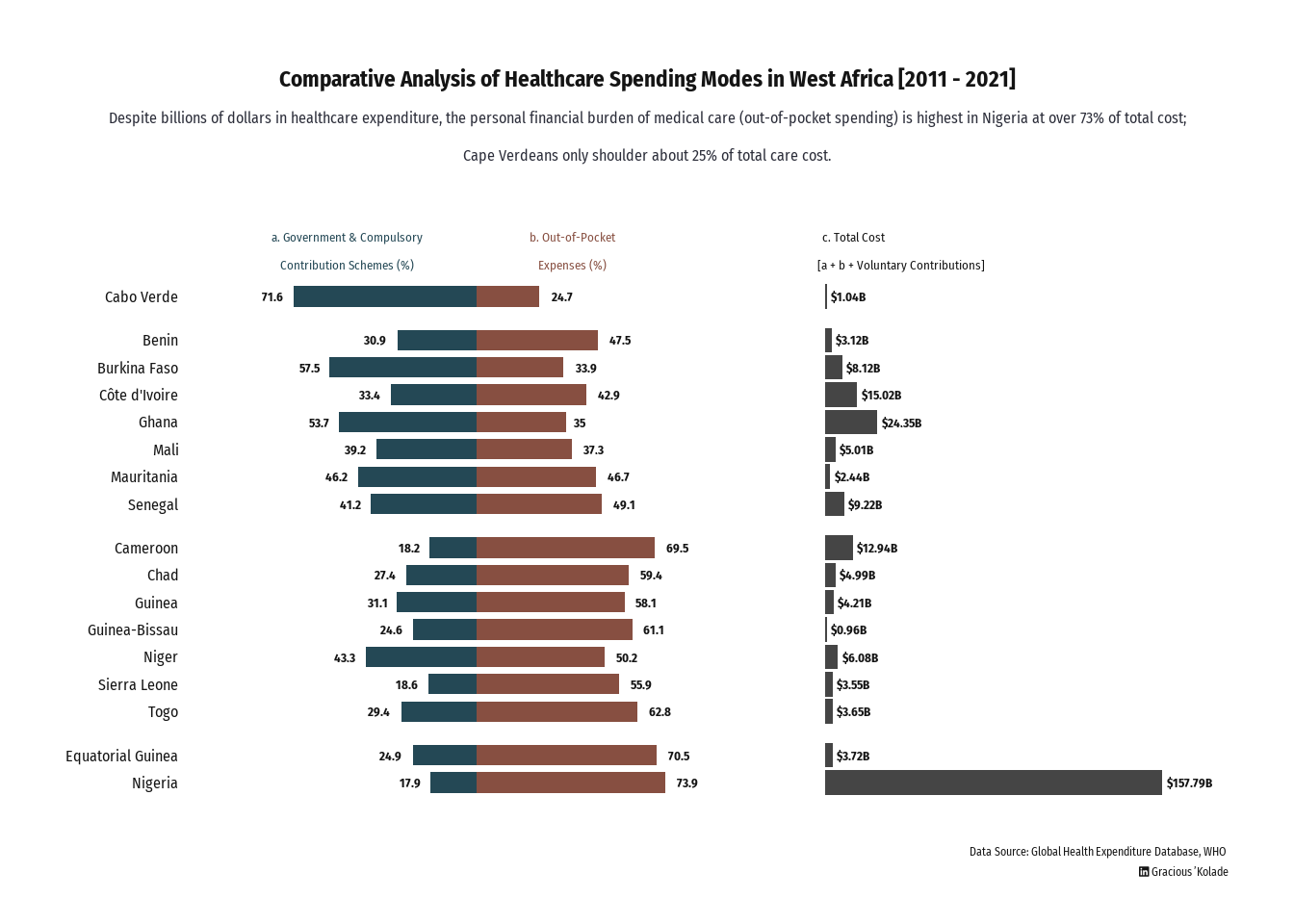
G. Save and Export Plot
ggsave(
  filename = "finalplot.png",
  width = 12,
  height = 7.5,
  dpi = 100,
  bg = "#FFFFFF"
)
If you have an idea on how I could have improved a workflow within the project, kindly reach out.